I think this one is finished now - any tweaking will be minor.
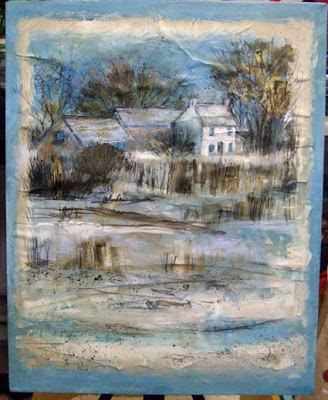
 The finished painting above against a white wall, showing the new dark edges, the deep sides of the canvas are also this colour.
The blue edge is gone. I realised that it was detracting from the painting, not setting it off and went for a cold dark bitter chocolate brown - lots of cerulean mixed into burnt umber. It echoes the drawing in it quite well. The dark colour needed to be narrower so the image has extended a little in each direction.
There is a little black in the form of charcoal but no black paint, simply very dark and varied mixes for the darkest areas.
I like the way that the metallic copper paint worked and the flashes of gold metallic tissue paper that flickers through in places. Sometimes it's fun to use unexpected materials.
You can see close ups of the textures and surface here and here.
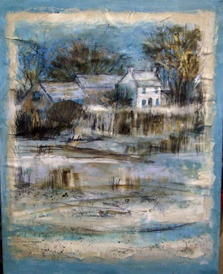
The creases and buckling have been dealt with, Touches of metallic copper paint have been added to small patches of warmth and tip a little balance back to the left hand side.
The middle building has been pushed back. The house has gained a lean-to in order to extend the building a little.
 stage 3 above The background has been altered to a mauvey blue to enhance the importance of the turquoise as it flickers through the painting but I'm still not happy with it.
There are creases from the buckling to deal with. With some I sliced the paper open and squished glue under and flattened the paper. With others I couldn't so I collaged more paper to cover the creases.
 stage 2 above glued to the coloured canvas, with an additional piece of painted collage added at the bottom.
I decided to add more foreground and make this a portrait format painting to give more lead in and saltmarsh with wet pools and reeds. The background at this stage is a turquoisey blue.
I decided to lose the right hand buildings.
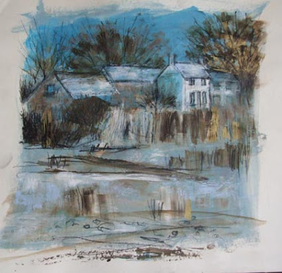
 stage 1 above, working on paper with metallic gold foil, ink, charcoal, paint- the first rough marks
This was a nightmare to glue down onto the canvas (above) as it buckled and needed lots of sorting out - next time I won't play safe, I'll work straight onto the canvas from the start, collaging elements as I go.
Experimenting like this I have no exact image in mind when I start out - I have a rough idea of the mood and composition but they are subject to change. Once some marks are down the painting starts talking back - elements need to be lost, others pushed and pulled to emphasise, cause to recede, play with lost and found edges or reflections .... whatever evolves.
This is like jazz to photorealism's Bach! extemporise, change, don't follow the notes dictated :>)
I'm thinking about putting some lessons together for online teaching at some point soon - what do you think? about experimenting, loosening up .....playing with paint and the visual language of marks.

9 comments:
How odd - going backwards through a WIP. All the more revealing I think to see just how it has changed as you've worked on it.
I like the new narrow dark edge - you could start a new fashion with that!
I think it's now looking very impressive. So where are you going to show it?
at the local museum
We have an annual show there plus the project show - it goes on for several weeks
yes, I felt it showed better how unformed the original version was compared with the final - which has the, what I think of as 'bite' - that bit where the balance is worked out and contrasts in tone sorted and the way that colour weaves through finalised.
It was interesting for me when I put them together like that - as you alter something as you go, you sometimes wonder if it was for the better when you no longer have the former version to compare it with.
I do like this piece and its good to see and understand your thoughts and the process around creating it.
Some pieces really do take over and dictate how you handle them. I think my current one is rather like that. Going with the flow creates amazing results sometimes. As with this piece.
It looks stunning vivine...I am amazed how much the dark edges change the atmosphere; giving it so much more drama and impact. seeing it from start to finish and following your evolution of thougts, is grea! Congrats..this is a show piece, fitting for the museum!
Ronelle
thanks Jeanette and Ronelle :>) I have to get on with the rest of the series now and get myself moving
I LIKE THIS VERY MUCH. BIRTHING FORMS ON A BLANK SPACE IS SO EXCITING.!!!!!!! SUSAN DROZDA
http://drozdadreams.blogspot.com/
thanks Susie - it certainly is :>)
I thought I had already commented, but I see I have not. There's a great balance here between the glowing copper touches and the cool blue and umber areas. In that way, you've perfectly captured the tension between light and dark, warm and cold in this wintry scene.
hmm, thought I had said something too...but no! Looking good Viv, specially the little glints of copper, tho I suspect in real life they are even better!
Post a Comment