Friday 27 February 2009

Stormy Waters - book reviews

Looking for solutions to your painting problems? Particularly working with colour, light and composition? Why not turn to the masters?

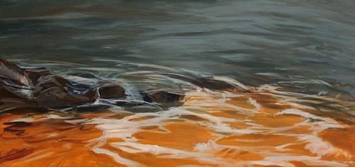
From my first days painting I have copied 'masters', be they old or contemporary, to learn how to handle my paint. And now when I'm having problems, need inspiration, or just need exercises to get started on a day, I will still do quick tonal studies of master paintings. It's a great habit to have. I've even spent hours in the National Gallery doing sketches of just the background landscapes of Dutch paintings - who cares about the foreground boats, buildings and animals, the things they have going on in the background are amazing!

For my problem "Storm" painting (see my previous post) I pulled out two of my favourite seascape books to analyse what other painters have done to capture the mood of rough seas.

Winslow Homer: Poet of the Sea
From the exhibition at Dulwich Picture Gallery in 2006.
The catalogue of the exhibition includes images of drawings, studies, watercolours and large-scale oil paintings. Some of Homer's work didn't quite connect with me, mostly the more nostalgic type images, but others were incredibly strong with the sea itself bordering on abstract paintwork. So I flip through it often to see how he captured those moments of movement and drama. (I haven't yet found a book with reproductions of Turner that I'm happy with, so for now I rely on postcards and visits to the National Gallery or Tate Britain to see those.)


Art for the Nation: The Oil Paintings Collection of the National Maritime Museum
Even though I live next door to it I had to have the catalogue of the NMM's collection in my grubby little hands for any given moment! This book covers themes from the whole collection it isn't just traditional seascape - the museum also holds important materials relevent to periods in maritime history such as shipping, slavery, colonization, and war. But having a book with such a wealth of sea-related artwork is necessary for me as a marine painter. Like with the Dutch paintings (and some of these are Dutch too of course) I can flip through and sketch the backgrounds, the use of contrast in the sky or the lines that break up the canvas. I'd highly recommend this for anyone interested in painting seas or ships.

So what are you favourite books for water or sea references? Or do have another important resource for working out your painting problems?

I'm still stuck in that storm, but will get back to you in March...
Reblog this post [with Zemanta]

Thursday 26 February 2009

Stormy Waters - trouble with composition

Some progress from the abstract camp!

Back in this January post I began my adventure in trying to paint a rougher sea for the first time - trying to capture more threatening moods in the sky, more crashing waves, but with my usual soft minimal look. My preliminary sketches were more freeform, and the canvas itself has been more exploratory. Unlike most of my paintings I decided to just dive into this one and see what happened, allow myself experimentation.

It all started well. Some dark layers, bringing tones and composition upwards, over the eye-line of the viewer. At an early point I liked the underpainting so much and felt I wanted to capture some of it in the early stage for "light" lines to indicate, perhaps, foam on the waves. So I put down masking tape that I could glaze over and remove later to bring back those elements.

Painting, painting, darkening, lightening the crashing waves, and got stuck. But of course there's that very misleading tape that actually isn't an indication of what's underneath - distracting me from what the whole looks like. So I removed it to reveal... well, something interesting. Interesting isn't necessarily a good thing!

So now I'm really frustrated. I have to keep reminded myself that this canvas is meant to be an experiment, but it's all to easy to get caught on in the drive to "finish" something after so many hours of investment.

The problems?
  1. Composition. I've said it to myself, on my blog and probably on Watermarks too - composition is the number one thing that cannot be overlooked. If I don't sketch, don't think about a composition it's inevitable that the painting 90% of the time doesn't work and has to be recovered with a new stage of composition. Yet foolishly thought that I could ignore it in the name of creativity.

  2. Working on pieces and not the whole. Yes, we all fall in love with parts of our pictures - little passages of wonderful colour or brushwork. But it is at the peril of neglecting the whole, the balance, how the picture works as a single effect. I was taught to always work on the whole - not do an object then fill in the background for example - progress on one part, then go work on another part to the same degree. Step back and look. The masking tape in this painting misled me and I should have planned more (error 1) and kept better awareness of the tones and colours underneath.
Trapped in the storm for now...
Reblog this post [with Zemanta]

Tuesday 24 February 2009

Fish printing - gyotaku

Capelin print
5.5 x 7 ink

Last week Robyn Sinclair sent me a link about fish printing. I'd never heard of it before and was fascinated by the process. This Japanese method of creating prints from a real fish is called gyotoku. Gyotaku basically means 'fish rubbing' in Japanese. The fish prints (commonly called fish rubbings) are the mirror image of one side of the fish, each characteristic of the fish is recorded - every scale and fin's reflection is transferred to the paper.

The most popular form of Gyotaku fish art is called the direct method. The fish print is created by rubbing a piece paper on the side of an inked fish. The fish eye is painted by hand after the rubbing is made. Only a few high quality prints can be made from each fish and each fish prints is unique.

Living on an island you'd think it would be easy to find a fish, wouldn't you? Not quite so, at least on a Sunday. You can read about that on my blog.

Despite not having the appropriate fish to hand, I made do with what I did have and tried a couple of prints tonight and have to say that, even though there is a distinct fishy smell in my studio, I love the results and the possibilities are endless for this process.

Here is the little capelin having been inked. I used a brush to apply the ink and I figured a brayer would just squash him into oblivion. I then experimented with a few types of paper. I had a lightweight print paper, almost translucent but found that it absorbed too much moisture and blurred the belly of the fish. The secret seems to be to wrap or gently mold the paper around the fish to get a print. Perhaps I was a little heavy handed on the first couple of tries.

Next I used Somerset printing paper and that worked beautifully, if not a little difficult to press against the fish as it was much heavier.

My final paper was a scrap of yupo which turned out better than I anticipated, but a little paler than the others.

Despite the lack of fish quality, it worked in my favour in some ways. The fish curves make it alive even in death, mimicking the movement through water.

Capelin print on Yupo

Its ice fishing season and I'd like to get a little trout to experiment with and once I can get the time to get to the market, I'll find some other fish to practice with. Meanwhile I will be adding other mediums and colours to some of these prints to see what I can come up with. A lovely mottled watercolour background perhaps or one of the sheets of that lovely handmade journal that I bought.

Experiments are such fun, even if The Other One thinks that I've lost it when he asked what on earth I was doing to the fish.

Sunday 22 February 2009

Waterways Project Hits Pay Dirt


Lake Michigan/ Gary Indiana Winter 09
watercolor, ink and mud on paper

My endless love affair with media took me to the banks of the Des Plains River this week. Yes, Waterways is getting down and dirty. Playing with mud, mess and all, evokes childhood mud pies and I had absolutely no expectations. As a result, I was rewarded with a new direction for my project. The way the mud granulates and shifts when I tilt the paper, suggests geology to me. I'll be investigating the bed rock under our area waterways now. Thoughts of geologic time compared with the very tiny human structures, places things in their proper perspective. Helps me to remember humility in the face of natural forces.

Vivien has suggested stabilizing the mud by mixing it with PVA. I'm going to try this and perhaps a spray matte finish. Any other ideas?

If you'd like to see one other mud experiment, I have one posted on my blog heree.

Saturday 21 February 2009

Sea arches

Sea arches - The Dungeon
oil on canvas panel 5 x 7
Bonavista is where modern North America began. On June 24th, 1497, an Italian explorer sailing under the British flag for King Henry VII, made landfall in the New World. "O Buona Vista," Giovani Caboto was said to exclaim after nearly two months at sea. Oh happy site! News of the existance of the this New Found Land - and the riches of the Grand Bank fishery - spread throughout Europe after Cabot's return journey across the Atlantic.
The Dungeon Provincial Park is on the Bonavista Peninsula and contains a pair of sea arches formed through many many years of the ocean washing over the rocks.

A sea arch is a natural opening eroded out of a cliff face by marine processes. Some arches appear to have developed for surge channels, which are created by wave refraction causing the focusing of wave fronts on the side of a headland. More generally, arches develop where waves attack a plane of weakness which cross-cuts a promontory. Caves produced on either side of promontory may become joined over time to become a tunnel and, finally, an arch.

These particular arches in Dungeon Provincial Park, like all sea arches or caves, have a life expectancy depending on the type of rock and seas and how quickly erosion takes place. Once a sea arch loses its keystone - the arch portion of the structure - it then turns into a sea stack.

Sea arch - Laguna beach
19 x 25 pastel

I am interested in the way that the elements sculpt the land and always seek out similar structures when I can. A sea arch on the beach in California was one of the pieces that I drew a couple of years ago and I hope to find a few more sea sculptures this summer.

The image on the left is the initial working sketch for the larger piece.

The video clip below brings you to 'The Dungeons' to let you experience the sea arches for yourself.


Friday 20 February 2009

The pond and the sea

The pond and the sea. As concepts, metaphors and symbols, they are really miles apart, aren't they? Take these two poems by Rainer Maria Rilke: Firstly, the pond in Fortschritt/Progress:
wieder rauscht mein tiefes Leben lauter, als ob es jetzt in breitern Ufern ginge. Immer verwandter werden mir die Dinge und alle Bilder immer angeschauter. Dem Namenlosen fühl ich mich vertrauter: Mit meinen Sinnen, wie mit Vögeln, reiche ich in die windigen Himmel aus der Eiche, und in den abgebrochnen Tag der Teiche sinkt, wie auf Fischen stehend, mein Gefühl.
And an English version is here:
The deep parts of my life pour onward, as if the river shores were opening out. I seems that things are more like me now, that I can see farther into paintings. I feel closer to what language can't reach. With my senses, as with birds, I climb into the windy heaven, out of the oak,and in the ponds broken off from the sky my feeling sinks, as if standing on fishes. (translation by Robert Bly)
Where the wild things live 
Where the wild things live, detail Soft pastel on Arches, 58x39cm

Secondly, Der Einsame/ The lonely one
DER EINSAME Wie einer, der auf fremden Meeren fuhr, so bin ich bei den ewig Einheimischen; die vollen Tage stehn auf ihren Tischen, mir aber ist die Fremde voll Figur. In mein Gesicht reicht eine Welt herein, die vielleicht unbewohnt ist wie ein Mond, sie aber lassen kein Gefühl allein, und alle ihre Worte sind bewohnt. Die Dinge, die ich weither mit mir nahm, sehn selten aus, gehalten an das Ihre - : in ihrer großen Heimat sind sie Tiere, hier halten sie den Atem an vor Scham.
I found a translation by Phillip Kellmeyer (with a few alterations)
The lonely one Like someone who sailed distant seas, I am with the ever natives; full days are standing on their tables, yet for me distance is full of promise. In my face a world reaches in, perhaps deserted like a moon, they leave no feeling alone, and all their words are inhabited. The things which I took with me look rare, compared to theirs -: in their great home they are animals, here they hold their breath in shame.
The one, the former, uses the pond as a metaphor for introspection: for digging deeper, further and further down to reveal, unearth one’s authentic self. ‘My sunken treasure’ by Duke Spirit captures that, don't you think so?  The other, the sea, is full of expectation, anticipation. The gaze turned to the horizon, the distance, the afar, expectant of what may come. Hm... while I've been doing some thinking around this when, before and after painting and printing, I think I may continue that - I find it helpful in trying to let some of the more abstract aspects of the scenes I'm working on develop. What made me think of this? Distance did, and how it's connected so closely to the sea for me. It is becoming a bit clearer since I've continued to work on the ponds - in drawing as the detail above shows, but even more so in printing, but that's for another post.

Tuesday 17 February 2009

Stones


Stones
Triptych 
Oil on gesso board
15cm x 15cm + 15cm x 36cm + 15cm x 15cm
or 6in x 6in + 6in x 14.2in + 6in x 6in
This was an interesting painting to make.  The initial sketches were made standing in very cold water drawing in quite a frenzied active manner, then a slower more contemplative watercolour and finally the oil painting which I worked in complete silence.
Which is strange for me. 


I usually have music playing but, perhaps this time, I didn't want to influence the mood of the painting.  It had a definite flow and pattern of its own and it was quite complicated to see.  I keep whizzing back on my chair trying to see the overall shapes and patterns.

This is where I work and that is the chair that whizzes.  The detail for this triptych is granite shot through with little dyke's of pegmatite or mica and for this picture I brought my subjects home.
The detail paintings I thought would be easy but in fact they seemed to require quite a lot of concentration and involve a lot of layering of colours. And splattering, and weaving, and laying on of paint soaked threads.
So it seems as if this series of triptychs are becoming very meditative indeed.


Monday 16 February 2009

Finickiness, begone!

I vowed last week to banish finickiness from my water paintings. Working with a wider surface made me realize that the small size of my earlier studies (11" x 14") has contributed to that tendency to make too many marks--I want a sense of energy and movement and, in trying to convey that sense, I  cram too much visual info into too small a space.
The 12" x 24" board used here isn't big by anyone's standards, but it's bigger!
Iceland water's edge
I reworked and calmed down some areas in one of the two paintings I posted recently.Iceland rocks and water
I've discovered a wonderful source of water imagery about two and a half hours from my house. Yes, there's the coast, but that's not what I'm talking about. I'm keeping my lips sealed for now, but I am SO excited! Stay tuned! (I'll need warmer weather, but that will be heading to these parts soonish!)

Aylestone Meadows, winter light

Aylestone Meadows, late afternoon sunlight on a cold cold day. Charcoal and pastel, Vivien Blackburn


I've virtually finished this larger pastel of the willows now. It's 16 to 18 inches, though I haven't actually measured it yet. There's a write up here. It was done mainly in Unison pastels as I love their rich velvetiness and the way they don't disintegrate like some brands.

I wanted to catch the cold pale colours of the landscape and sky with the dramatically silhouetted pollarded willows with the warm late sun amber on one side of them and the cold sheen of the water behind.

I'm also working on a linoprint of these trees - you can see an early stage pencil rubbing of it here.

These trees aren't traditionally beautiful (they were up to last Spring :>( they were BIG trees) but the whippy branches slice the sky into little triangles and geometric shapes and they are very interesting to draw.

update: linoprints of the willows here

The Studio Boat #2 - "Monet Painting on His Studio Boat"

Monet Painting on His Studio Boat (1874) by Edouard Manet
Oil on canvas, 82.7 x 105.0 cm
1913/14 Tschudi contribution Inv.-Nr. 8759 Neue Pinakothek, Munich, Germany

Manet painted Claude Monet painting in his studio boat with Monet's wife Camille in the background in 1874.

According to John House (Monet: Nature into Art) this painting by Manet has been seen by some as a tribute to "Avallant(Le dejeuner dans le bateau) (Down the Hatch-Dinner on Board), from the album Voyage en bateau (Boat Trip), an 1861 etching" by Charles-François Daubigny. This appears to refer to the position and angle of the studio boat rather than the activities of its occupants. Others think it more likely that it relates to Daubigny's 1866 etching Le botin Conflans (Le paysagiste en bateau); (The landscape painter in a boat).

I'm left wondering where Manet was.....

Thursday 12 February 2009

Waterman's Pond


Waterman's Pond
pastel on painted paper

I've been tied up doing portraits for the past week or more but water still sits in my head and ideas swirl around, waiting for opportunity to come out.

The strangest thing about the Watermarks project is how it coaxes things out of me that I never knew were there. My detail in portraits is realistic but I'm finding that my water projects are becoming more abstract at times. I'm exploring more shapes and colours rather than detail.

The inspiration from this piece comes from two sources. One, a section of Waterman's Pond which is very close to where I live and which I drive by every day. Its covered in ice now and with our strange winter of freezing and thawing the surface had a mix of snow and a sheen of polished ice on the surface in the early morning.

Some bracken poking up through the snow layer mixed with dirty snow from the side of the road all added to the scene.

The second form of inspiration came from a journal that I recently bought. Its almost a piece of art in its own right. Its made of Arches paper which is painted with a mix of water, ink and liquid acrylic paints forming organic patterns.

I used the basic shape that was present in the painted paper and let the pastels do the work to create the stream still flowing and the sheen of the ice beyond the snowbank. Early morning light here gives an almost pastel colouring to water and snow that I find very appealing.

It seems I'm doing a lot of preliminary work parked in snowbanks in the early hours of the morning. I do get odd looks but the advantage is that its too cold for people to stop and ask what I'm doing.

Tuesday 10 February 2009

Dipping in water again

Here's the thing. I'm posting these water studies, not because I think they're wonderful finished paintings---no! They are simply steps along the way, as I try to figure out what the heck I'm doing here on my watery painting journey. Though I'm rusty after mostly drawing for the past four years, I've been painting assiduously the past two weeks and am committed to doing so all this year--something's going to happen, painting-wise, eventually!
My goal was/is to reach a level of stylization and abstraction of the subject matter, but in what guise, the process itself will reveal, through time. I, personally, have no clue. And if I don't, how could you?
So I just start painting each painting and then I'm as surprised as anyone when something very 19th century, as in the first study, stares back at me. I don't hold with people who try to paint like, say, Monet (I'm not talking about learning by copying from the greats, but consciously making finished paintings to sell, in a period style.) But I digress.
Anyway, I was dismayed, briefly, to see myself channeling some 19th century hack painter, but my way is to just do it and get over it. Get on to the next thing,
The second painting is rough but I'm not going to take it any farther. It's served its purpose. I like the movement in it. That is one of water's chief attractions as subject matter to me.
Both studies are acrylic on board, 11" x 14", and both are based on sketches and photos from a trip to Iceland last August.
My husband and I are driving to the coast this weekend. Our coast is placid, very unrocky and unIcelandic. Sometimes you float where you're planted.

Onward.

Monday 9 February 2009

The Studio Boat #1 - Monet's bateau atelier

Le bateau-atelier (1874) by Claude Monet (1840 - 1926)
19-5/8 x 25-1/4 inches, oil on canvas

Kroller-Muller Museum, Otterlo, The Netherlands

The studio boat has an honourable history. It's been responsible for an awful lot of art which now commands very high values.

Claude Monet is renowned for painting plein air. He even took his studio outdoors and on to the water for some of his paintings. In 1873 Monet had a 'fruitful sale' which enabled him to have a studio boat built. He may well have decided to get one after an association with Daubigny (a member of the Barbizon School) who had a studio boat which he used a lot to paint along the Seine and the Oise. Monet seems to have moored his boat close to home at Argenteuil and later Vertheuil and only used it within a short radius of both homes situated on the north bank of the River Seine west of Paris.

Monet created three paintings of his studio boat and this is the first - painted in 1874.

This is the start of a series of posts about paintings of studio boats and about paintings done from studio boats - and of artists painting other artists in their studio boats.

Now - who wants a studio boat?

Sunday 8 February 2009

Napping Muse on Company Time


Here's a scary thought for a Watermarks member: I'm feeling adrift with my Waterways Project! Shouting for my Muse to wake does absolutely no good. So, I'm using this nagging twinge of anxiety to branch out and explore some new visual ideas. I'm very thankful for Tina's generosity in sharing images from her latest visual project:Wave Mechanics. Her photos are my jumping off point for playing around with various ideas. Thanks Tina!

If you want to see more visual trawling (for watery ideas), you can visit my blog for a slide show.


NOAA, the National Ocean and Atmospheric Administration (in the US) runs a site for Watershed Prediction for many rivers in the US.Here is the page for the Des Planes River Does anyone else have this sort of service in their country? If you do, why not share a link in the comments section.

Friday 6 February 2009

Aylestone meadows in the snow

Using coloured pencils in mixed media is something I use a lot but using them alone is something I only do very rarely.

This one of Aylestone Meadows in the snow, with icy frozen pools of water is done purely in cp on a buff coloured paper, 11 inches square. The white is a bit lighter than it looks here.

I missed the fluidity of paint - the lovely soft merging of colour that I can then enhance with cp's if I want. It reminded me why I don't very often use them alone!

The hedgerows and trees were silhouetted and the colours muted. I'd moan that it was cold (it was) but nothing like Jeanette's Newfoundland cold!

Yesterday the snow was about a foot deep in the countryside, soft and powdery and beautiful but I was teaching all day.

Today it had thawed a little and of course it's getting dirty and muddy along paths and by the roads and not so pretty any more. Which reminded me why I don't like snow much! I think my ancestors hibernated in the winter :>)

Thursday 5 February 2009

A week of water


For the past week I've been creating a series of photographs that show the effect of light on water. I have chosen the same viewpoint and a similar time of day, around 7:45am and taken a photo of whatever light conditions are present.

This past week has been either frigid or warm and wet so the light wasn't brilliant, however the variances in the light, while subtle on some mornings are present even if at first glance there seems to be just grey. And some mornings on the drive to where I take the image, I see glimmers of sunrise through the clouds that I know will have disappeared by the time I reach my destination.

I don't know if I have the dedication to create a 365 day photo project of this viewpoint, but I think that a week a month may be interesting, more so if I choose the days that the lighting is at its most appealing artistically.
Having the record of light conditions on water will be very useful to add to my references.

The water around Newfoundland is, for the most part, very clean and clear. The clarity of the water inspired this piece which is shown on my blog Illustrated Life. The rocks lying just beneath the surface add another dimension to the play of light on the water. While photos don't give the whole picture, they can serve as a bridge between real life and the studio work and in this climate are almost essential as winter makes plein air painting difficult unless from the confines of a car.

Monday 2 February 2009

The Ecology Park Pond in January

The first month of my new project to draw the Ecology Park Pond through the year has ended. I've produced a lot of new drawings this month so that has to be a good thing. Here's a montage. Strictly speaking it's including images from references taken at the back end of December but to all intents and purposes these are 'January output' so I feel good about that.


The Ecology Park Pond series - December 2008 and January 2009
top row:
(left) #1
Lily Pad Pond from Canal View Bridge - looking towards Tow Path Platform;
(right) #2 The Willows behind Dog Walker Bridge from the southern edge of Lily Pad pond
Middle row:
(Left)
#3Canal View Bridge and Moor Hen Pond 2nd January 2009
(Right) #4 26th The Willows across Moor Hen Pond 26th December 2006
bottom row:
(left) #5 - Willow Pond, 21st January 2009;
(right) #6 - Moor Hen Pond from the roof of the Ecology Centre 29th January 2009


The amazing thing is I'm just not getting at all bored by it. In fact I keep finding more and more views to do and am getting more and more out of it.

Last week I discovered the views of the Ponds from the roof of the Ecology Pavilion - it has a path on top! For some reason I've never been up there before - probably because I always approach the ponds from the towpath side. Looking down from the top was rather exciting - and resulted in #6 which you can see above. I was mentally working out how nice it must be to be up there one day in summer!

Benefits of the project after one month: I decided to make a list and keep this under review at the end of each month.
  • Improvement in observation: I'm looking much more carefully at the subject matter - observation at different times of day, different light and different weather (I'm looking out shoes which will be safe enough for me to walk up there today to see it in snow!)
  • Improved water awareness I'm getting much better at seeing and understanding how water works when it is in a relatively still setting - plus I learned an awful lot about ice earlier last month!
  • Developing photography skills - besides taking reference photos of the pond which help me think through compositions, I've also really enjoyed starting the set of photographs which are all about Textures of the vegetation around the pond - artwork in their own right!
  • Preparation and thinking for linocuts: I'm beginning to see how some of the references I've got of the vegetation and the surface of the water will work well in linocuts which I'm going to try very soon.
  • Colour awareness : I'm developing a real appreciation of the colours of January and winter - something which I just haven't had before
  • Twitcher tendencies: I'm getting very fond of the birds - which was something I wasn't expecting at all. I'm beginning to notice their habits and what they like to do. I can see a sequence of drawings on the implosion to the surface caused by coots diving for weed! I was also very puzzled by the raucous noise one male mallard was making up the far end of Willow Pond on my last visit - until I was stood the other side of the pond and realised I must have been standing right next to where he and his beloved are making a nest for their babies. There was lots of scooting in and out of where I'd been photographing vegetation! The mute swans who normally live on the canal are fun as well and very sociable and come to visit while I'm there.
  • Increased output: Besides the six coloured pencil drawings (all 36cm x 26cm) you can see up above, I've also got two more drawings on the go at present which will be added into the January month on my website! Plus I can see more I'd like to do.
In future I'll be doing a summary shortly after the end of each month of all the work done in that month - irrespective of which month it actually belongs to in the time series - and then sort out the artwork into the different months in the website galleries - see Ecology Park Pond Series - Drawings by Katherine Tyrrell

I now need to go away and place a large order for more Arches HP blocks!