Showing posts with label landscape. Show all posts

Monday, 12 September 2011

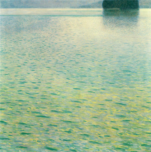
Klimt - Island in the Attersee

Island in the Attersee (1902) by Gustav Klimt

This painting by Gustav Klimt is one of my favourites.  It's called Island in the Attersee.  He painted more than one version - and this is the 1902 version.

I first came across it on the cover of the book about Klimt's landscapes which I currently have out of the library - see Gustav Klimt: Landscapes

I absolutely adore the colours in this work.  Colour was also incredibly important in determining the nature of Klimt's imagery.  I also love the really high horizon which is also very characteristic of his work - it plunges your focus into the way the surface of the lake looks.  It has a square format with distinct rectangular zones of colour.

The mountain lake called "Attersee" can be found in the Salzkammergut region of Austria. Klimt used to visit the small island in this lake in summer. Apparently the water is very clear and the lake is favoured by swimmers and sailors.

I wonder if this is the painting he used to hang on his wall so he could dream of summer days in the middle of winter!

I'm not drawing/painting a lot of water at the moment - which is not to say it's not one of my favourite subjects.  So I'm going to start posting work which I like which does portray water - and will maybe learn something in the process

Who's your favourite painter of water?

Wednesday, 9 March 2011

River and hills: Experimenting with an old collagraph cut off

River and Hills, 14x 4 inches, collagraph and cp, Vivien Blackburn


details to see the texture:


I came across this 14x4 inch collagraph in the 'do-something-with-this-later' drawer. I think it was an offcut from a larger collagraph plate, cropped before it was printed and then printed with the same inks that I'd been using (green and yellow), just to see what happened.

It had originally been vertical and part of a seahorses/underwater series of printmaking. Looking at it horizontally I saw a landscape with a river winding through.

Using coloured pencils I worked on it in warm rosy hues to contrast with the cooler green. I want to darken and cool with deep blue the area around the right hand tree a little before I'll call it finished I think. What do you think?

Coloured pencil works really well over collagraphs as it gels with the graininess of the print - which I'm pretty sure was on Fabriano Rosapina paper, which has a nice velvety feel adding to the grain. I've never been happy with the results if I've used watercolour or oil over them because of the sharp difference - the way it fills in the grain unlike the printed surface.

After working a bit too tightly sometimes recently :>(, it was very freeing to simply play with an image, pulling the landscape from the abstract shapes.

If you are interested you can see other collagraphs and the process here

Tuesday, 14 September 2010

work in progress, Vivien

Above and below: details from an experimental collage/mixed media development from tree sketches. Vivien


I'm experimenting with collage and mixed media to develop the recent images of trees (and of course water!)

The trees are done separately and stuck down with spray glue so that they don't become wet or stained with adhesive. I've played with marks - running paint wet-in-wet, splattering, drawing into wet paint with the wooden end of the brush, adding the occasonal bit of coloured pencil or watercolour pencil and keeping everything loose and abstracted.

There is a 'frame' around the central section, made up from trees at each side and tops of trees at the top - at the bottom the rocks create weight to balance these. The 'frame' is a deliberately disjointed, with elements that cross into it but a clear break elsewhere. (see link to whole image and further close ups below)

The pool with its reflections is worked loosely on yet another piece of paper that is collaged in.

Most of it is done in watercolour with different papers - white, cream and pale browns worked over in the various media. There is also coloured pencil, ink and a small touch of buff titanium acrylic in the final touches here and there.

(That's a colour I find really useful, particularly for doing the edges of canvasses - no mixing to match the colour for second coats)


Feedback/crit/comments very welcome :>)

Monday, 16 August 2010

Winter pool

Winter Pools, detail, Vivien Blackburn

This is a small mixed media piece, 10 x 8 inches of a winter pool on a still blue skied day. Above and below are close ups.

It was done on Somerset paper, in a mix of watercolour, coloured pencil, gouache and ink. I like the variety of marks possible with mixed media - the transparencey and looseness of watercolour, the splattering with it; the hazing of coloured pencil over watercolour washes to create layers of colour that shine through each other, the calligraphic marks of pen - biro in this case - and the covering power of touches of gouache. The paper is quite creamy and I wanted some pure clear white in the reflection, so used the gouache to lighten it where necessary.


Back to work as I've got to produce another 4 in this series .....

Tuesday, 27 July 2010

From the moor above Pendeen and the lighthouse

Moorland lane above Pendeen, Vivien Blackburn

Coming down the single track, twisty lanes from the moor down to the coast you get these views. Often the horizon is indistinct as it was in the close up of the lighthouse and there is a wall of blue ahead.

The earth banked stone walls are covered with bushes - mainly gorse up in the harsher conditions of the moor - and hundreds of wild flowers.

You see stone built moorland farms, built-into-the-landscape, huddled against the winter gales, old mine engines and small stone walled fields. You are totally enveloped within the banks of flowers and then suddenly turn a corner like this or see through a gateway - one painting opportunity after another!

see why I love it so much?