Showing posts with label acrylic. Show all posts

Thursday, 9 June 2011

World Oceans Day

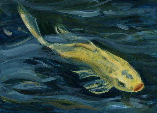
 Yamabuki
6" x 12"  acrylic

June 8th is World Oceans Day.  On World Oceans Day people around the planet celebrate and honor the body of water which links us all, for what it provides humans and what it represents.

It seemed appropriate that this little golden fish represent the importance of the oceans.  Yes, its not sea dwelling, but water, even fresh, eventually becomes part of the ocean and the hydrological cycle repeats over and over.

The term nishikigoi in Japanese means "colored carp" and refers to the magical realm of koi fish. The Japanese invest symbolism in many animals and especially koi carp, the common goldfish being the domestic version of carp. Yamabuki: The gold fish represents gold, wealth and prosperity.

Wealth is not always measured by physical goods and money.  Wealth comes from what is around us naturally, how we treat it and how we treat ourselves and others. 

Tuesday, 22 March 2011

Finding the swan

Landwash
12 x 36"  acrylics


Sometimes it is difficult to move past the ugly stage of a painting.  Often it takes some time to pass before the mood and inspiration comes to help ease it along to where it should be.  Most pieces have their swan in them, it just takes a bit of coaxing sometimes to get it out into the open.

I thought I'd share the final images of a couple of pieces that I showed here in varying stages which are now complete.

The first, Landwash, is in acrylics on a 12" x 36" gallery canvas.  From the last piece I had shown here I added some glazes of colour to the sea and shore to give it interest and break up the expanse of silvery water.  The sun hitting high points of the water and glittering across the surface completed it.

Earth's Eye
6 x 12 oils

The second piece was a study of a the water surface from an image taken at Gallow's Cove Pond late last summer.  I had put down the values and hadn't done much more with it, posting it here with another reflective water surface painting.   I hauled the canvas out again and added some detail to it.  The painting was done in oils on a reclaimed canvas 6 x 12" and the surface was a little uneven, so this will likely remain a study.

Friday, 29 October 2010

Mission Trails, California

detail from larger work

Katherine and I are taking part in an exhibtion in California in November with friends - details later.

At the end of this post is a slide show of the work I've done - there are 5 paintings, with close up details following.

The work is based around Mission Trails Park in California. I needed to work around how I was going to tackle painting an area that is so different from the usual land and seascapes I paint here, in a very different climate. Needless to say it ended up involving water :>) Unusually for me, I was working on painting a place I don't know personally - a friend had provided photos and I used Google streetview, which was really useful for getting a feel for the area and did lots of research. Still, it was difficult. I usually work plein air and learn the feeling of a place as I sketch.

I started with the coloured pencil drawing of a still pool, reflecting the trees behind, the dry landscape very different from England - but the rocks and trees and reflections all interested me. I was trying to get to grips with the landscape there, the aridity, the rockiness, the mood.

As I thought about it, I realised that I wanted to abstract the images a little, play with texture, time, and shape and colour, experiment and include collage. All the works except for that first one are mixed media, using whatever was going to make the kind of mark I wanted. The joy of collage is the ability to move elements around to work out the composition before finally sticking down.

This is the final version that the above detail is taken from


It went through several incarnations on its way and further work with scissors as it became rather overcrowded and needed room to breathe :>) I would have liked to have given it even more room but had to work to a specific size - 11x14 inches so that it would fit the frames at its destination.

Each tree is a separate piece of paper, with watercolour, monoprinting and drawing to create the bark. The background is also collaged and then painted and drawn into.

Each was pure experiment with only a loose idea of the final result, responding to the marks, moving the trees and background pieces around until I felt they could be fixed.

There is watercolour in there, coloured pencils, ink, acrylic, gouache, biro (ballpen) and charcoal pencil - maybe other things that I've now forgotten!

The dark background helped with the fragmentation of the image, the changes in time/viewpoint and linked to the black of the charcoal and biro. It isn't of a specific place but plays with a mix of elements from many sources and imagination.

The colours play with warm and cool neutrals against the blue of the sky and reflections - the touches of warm apricot tones glowing against the blue (I hope!).

The 'some, a little and a lot' guideline applies - with most of the painting in neutrals, the blue and purple becomes more important.


If I'd had Sarah's instructions on varnishing watercolours in time I would have tried it out on this one - I think it would work best without glass.

you can see earlier versions here

Towards Dusk

This one again plays with the idea of time and fragmenting the image. Daylight moves into dusk.

What do you think?


Tuesday, 9 March 2010

Koi studies, part two!

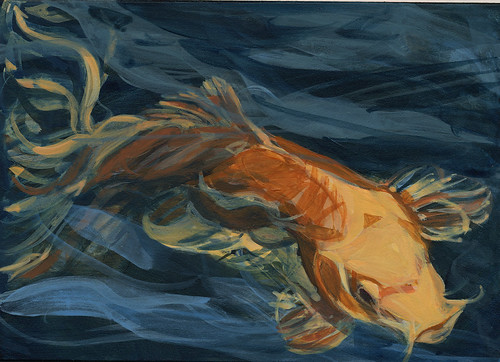
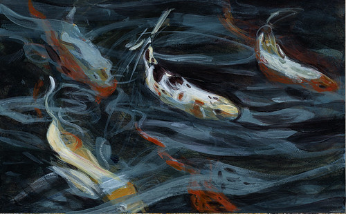
I am so glad I decided to make a series of 30 small studies (emphasis on STUDIES) of koi in water ---you cannot imagine how much fun I'm having!! I have painted in acrylics on a large-ish scale so intermittently over the last few years, that I had really forgotten a LOT about technique. The same thing happens when I don't cook ambitiously for a while. I forget nuances of flavoring and method. Which is odd since I've been a pretty avid cook all my adult life, but there we are.
I have already moved on a bit, technically, from this batch of four, so I thought I'd better share with you THESE in a batch, so whatever progress and direction my process reveals will be clearer to you and to me.
At this point, I promise you that I have NO idea where all this is leading! That it will lead somewhere interesting, I have no doubt---fish by fish, swirl by swirl.Koi study series:ochreKoi study series: yellowKoi study series: concentricKoi study series: multi
I have to stop myself from fiddling endlessly with these, stop myself from wanting to get everything "right"----they are teaching me so much as they are. Now, on to the next group of four!

Wednesday, 10 February 2010

Koi in progress


You don't know how hard it is for me to show unfinished work! As I've said before, it goes against my very private artist's nature and my training, too, BUT this blog is about all the aspects of the making of art about water and the processes involved, so here we are.

What I love about koi as subject matter is that, in painting them, I can give free play to my love for calligraphic shapes, my attempts to render movement and energy, and my passion for the physical qualities of paint and painting surface.

Painting koi in water is a revelatory experience. It is a meditative experience. It is challenging, and it is, above all, and shockingly, fun! Since I am not a natural painter in the way I am a natural draftsman, I don't often feel that painting IS fun. But when it is going well, there's nothing so gratifying to me.

In the first two paintings above, you'll see my struggles with opacity and transparency in rendering water using acrylic paints. This struggle will be ongoing over the next months as I continue this series. But I welcome the struggle. I'm learning from it. This is what I mean about the revelatory nature of this project.
I've begun a series of small studies (about 5" x 7") to give me quick ways to explore various palettes, various acrylic mediums to add for texture and flow and transparency, various compositions, and to help me define the shape, form, movement inherent in MY approach to this subject. I'll make 30 of these, one daily when I can, in addition to continuing to work on my large pieces. I have 6 or 7 larger pieces going right now!. Here are the first three studies. They are VERY loose, very coarse. They're exactly what I need!


These issues of transparency, opacity, texture, and wateriness have been with me for a long while. Here is (a very bad photo of) one of a series of paintings I made around a lotus theme in 2005. It may be that I'll move back to a more abstracted style such as this. It may not. I trust the koi to show me the way.

Monday, 1 February 2010

The Crowns, Botallack, Cornwall, mixed media

The Crowns, Botallack, detail, mixed media on canvas, Vivien Blackburn

The Crowns, Botallack, Cornwall, mixed media on 20x16 inch canvas, Vivien Blackburn

detail

I think it's just about complete - any tweaking will be minor.

It's a nightmare to photograph to catch the colour that's there - the milky greeny toned sea around the rocks isn't showing very well.

The old ruined mine buildngs seem to grow out of the rocks, being built of stone. I wanted that feeling of maybe at first not noticing them - the sea and the wild scenery is the 'star'.

The path down to the engine house is narrow and would have been scary in winter gales - and then once undground and under-sea, they would hear the boulders grinding on the sea floor, just feet above their heads.

The original sketch was one of those blue blue days, when the sky and sea seem to merge.

The colour of the sea around the rocks doesn't show well but is that beautiful milky eau-de-nil colour of water full of air bubbles from the waves breaking. For these sort of days in Cornwall I really need my pthalo blue and viridian :>)

And the next one in the series has the first sketchy marks down - this time Runswick Bay in Yorkshire and probably another limited palette piece like Saltmarsh. You can see it here.

Saturday, 20 June 2009

Acrylic sketches

Savage Cove
6 x 8 acrylic

I've taken some acrylics on a field trip to the ocean for a couple of plein air sessions. Its a challenge working with acrylics outdoors, at least for me. They dry so quickly, but on the other hand, if I sit them on a wetted paper towel and keep rewetting it, that keeps the palette from drying, but it still leaves me with little time to manipulate the paint on the canvas. I end up with lots of thin layers or else big gobs of paint that give me a little more wiggle room.

I wanted to try acrylics in plein air so that I could more accurately capture light and colour instead of having to refer to photos which never seem to capture quite the same colours. I wanted to try acrylics so the painting would dry and not smear all over before I got it home and its easy to wash up on the spot, not leaving the steering wheel of the car paint stained as it seems to do when I use oils plein air.

Waves, Pouch Cove
5 x 7 acrylic sketch

It has benefits, but is also frustrating too. I may in the end get some acrylic extender to prolong the time I can manipulate it, if I continue with acrylic sketches. I like being able to get that instant feel of colour and light, but hate fighting with paints.

I know there are other , more convenient mediums such as pen and ink, or coloured pencil or even pastel that I can use to do some plein air sketches, but I like the almost instant feel of acrylics or oils. The one up from a photograph perhaps.

I`ll continue to experiment with acrylics for sketching outdoors and see if those little pieces will translate into larger pieces back in the studio. I wonder how many sketches actually turn into larger pieces for artists?

Friday, 10 April 2009

Cornwall to Norfolk in Tiny canvasses


I've been doing some tiny canvasses for my Etsy shop - and coincidentally, so has Sarah! (hers are gorgeous check out her blog ) We both posted at the same time and had both chosen 4 inch squares, though hers are on wood panels and mine are on canvas.

These are 4 inches square, on deep 1.5 inch sided, gallery wrapped canvas.

They work well in a group and even look nice standing up on a shelf as they are so deep.

I really enjoyed doing them and for a change used acrylics, not my usual choice of medium but it worked well for me.

Saturday, 4 April 2009

Old slate quarries, water, reflections and woods


update on the waterways project: Vivien

I've been looking at those old flooded slate quarries and the reflections in the water. We've had some lovely spring weather and the sky was a vivid blue so the water was too :>)

3 of these are of the little quarry near Swithland Woods. It's on private land so it's impossible to get different viewpoints. The reeds and tangled branches against the blue water are Groby Pool, a much larger ex-slate-quarry that has been dammed and is a lovely wild life reserve.

I'm really enjoying these and with the warmer weather hope to get out and do more sketching as soon as possible.

The coloured pencil one is too 'tight' I prefer the watercolour and I'm planning a 40 inch square canvas of those calligraphic reeds and branches against the rippling blue water of Groby Pool.

I've just come back, exhausted, from a very good exhibition of watercolours at the Mall Galleries in London - well worth visiting, with some lovely inspirational pieces. Also some naff ones and good paintings spoilt by truly AWFUL framing but lots of interesting stuff in a very diverse range of styles and concepts.