Showing posts with label famous artists. Show all posts

Sunday, 18 September 2011

Klimt: Park of Schönbrunn

Park of Schönbrunn (1916) by Gustav Klimt

This is another landscape painting involving water by Austrian artist Gustav Klimt.  This time it's a bit of a puzzle.

The painting is of a lake in a Schönbrunn Park in Vienna, Austria.  Last November I tried to do a copy of this painting - see Schönbrunn Park - after Klimt - but I think the original is soooooo much better!

I like the fact that it's a puzzle picture.  You have to stare at it for a bit before you realise this is a painting of a large expanse of water in the middle of a very green park.  Most of the reflections are quite subtle.  The only really significant clue are the clouds in the bottom right hand corner which are only hinted at in the top right corner.  You still have to look at it again to make sure this isn't some isolated pond reflecting the sky.

I like paintings which are not obvious!

Monday, 12 September 2011

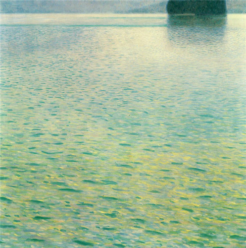
Klimt - Island in the Attersee

Island in the Attersee (1902) by Gustav Klimt

This painting by Gustav Klimt is one of my favourites.  It's called Island in the Attersee.  He painted more than one version - and this is the 1902 version.

I first came across it on the cover of the book about Klimt's landscapes which I currently have out of the library - see Gustav Klimt: Landscapes

I absolutely adore the colours in this work.  Colour was also incredibly important in determining the nature of Klimt's imagery.  I also love the really high horizon which is also very characteristic of his work - it plunges your focus into the way the surface of the lake looks.  It has a square format with distinct rectangular zones of colour.

The mountain lake called "Attersee" can be found in the Salzkammergut region of Austria. Klimt used to visit the small island in this lake in summer. Apparently the water is very clear and the lake is favoured by swimmers and sailors.

I wonder if this is the painting he used to hang on his wall so he could dream of summer days in the middle of winter!

I'm not drawing/painting a lot of water at the moment - which is not to say it's not one of my favourite subjects.  So I'm going to start posting work which I like which does portray water - and will maybe learn something in the process

Who's your favourite painter of water?

Sunday, 8 August 2010

The Studio Boat #3 and Monet painting poplars on the Epte

The Studio Boat (1875) by Claude Monet
oil on canvas / private collection

Claude Monet made a number of paintings of his studio boat.  This is the second painting - with one more to come.  In 1875 Monet was painting on the River Seine near Argenteuil.

I used to spend ages trying to work out how Monet painted some of his paintings - until I went to see the Manet to Picasso exhibition at the National Gallery in 2007, got the audio guide and heard how his habit was to use a studio boat on the River Epte - which is how I got interested in paintings of his studio boat.  (Click the link to see the location of the River Epte near Monet's house at Giverny)

Below is a sketch I did (see Sketching at the National Gallery: "Manet to Picasso") plus an extract from what I noted at the time.


Copies of National Gallery paintings from Claud Monet's "Poplars on the Epte" series
oil on canvas
copyright Katherine Tyrrell
I started with two of my favourite paintings from Monet's Poplars on the Epte series. This time I got the audio guide and learned that:
  • there are 24 paintings in the series depicting the poplars at different times of the day and in different weath
  • Monet painted them from a flat bottomed boat borrowed from his friend Caillebotte which had been specially adapted so that it could take canvases of different sizes. ( The painting from a boat habit reminded me of John Singer Sargent who used to sketch in Venice while sat in a gondola - I'm beginning to think about devising a boating expedition!)
  • He had to buy the land that the poplars stood on to avoid them being cut down before he had completed the series!
The one on the left does not compare well to the original due to lack of the right colours in my tiny pencil case. The one on the right worked rather better - but I could have done with my big sketchbook!

Given the dates of the paintings I'm guessing Monet's habit of using a studio boat must have started much earlier when he first started living next to rivers.

For earlier posts about Monet and studio boats see:
For more about Monet see Claude Monet - Resources for Art Lovers

Thursday, 14 May 2009

Van Gogh's fountain

I like studying what sort of marks artists make when trying to depict water. Here's an example of how Vincent van Gogh drew a fountain when using pen and ink. I spy ripples drawn with a variations in the weight of line plus dappled shade and spray!

Bear in mind he's an inpatient at the hospital at the time!

Fountain in the Garden of Saint-Paul Hospital
Vincent van Gogh - 1889
Van Gogh Museum (Netherlands)
Drawing in Black chalk, pen and ink
Height: 49.5 cm (19.49 in.), Width: 46 cm (18.11 in.)

Friday, 1 May 2009

Antony Gormley - Another Place

I've been sent a link to this video on Yahoo which was posted this week. This is what the author says about it.
This is one of the six final videos I am currently working on in my last year of Contemporary Lens Media at Lincoln University. It is a wordless documentary about Antony Gormley's "Another Place" at Crosby beach, near Liverpool. In this piece I have combined visuals, sounds and music to allow the viewer to use their imaginations, enabling them to decide on what these figures are about. Music by Dan Whitfield. Filmed and Produced by Frances Twiddy.


For those interested in Antony Gormley's work you can find out more in Antony Gormley - Resources for Art Lovers. You can see photographs on Flickr here Flickr - "Another Place" by Antony Gormley

Monday, 16 February 2009

The Studio Boat #2 - "Monet Painting on His Studio Boat"

Monet Painting on His Studio Boat (1874) by Edouard Manet
Oil on canvas, 82.7 x 105.0 cm
1913/14 Tschudi contribution Inv.-Nr. 8759 Neue Pinakothek, Munich, Germany

Manet painted Claude Monet painting in his studio boat with Monet's wife Camille in the background in 1874.

According to John House (Monet: Nature into Art) this painting by Manet has been seen by some as a tribute to "Avallant(Le dejeuner dans le bateau) (Down the Hatch-Dinner on Board), from the album Voyage en bateau (Boat Trip), an 1861 etching" by Charles-François Daubigny. This appears to refer to the position and angle of the studio boat rather than the activities of its occupants. Others think it more likely that it relates to Daubigny's 1866 etching Le botin Conflans (Le paysagiste en bateau); (The landscape painter in a boat).

I'm left wondering where Manet was.....

Monday, 9 February 2009

The Studio Boat #1 - Monet's bateau atelier

Le bateau-atelier (1874) by Claude Monet (1840 - 1926)
19-5/8 x 25-1/4 inches, oil on canvas

Kroller-Muller Museum, Otterlo, The Netherlands

The studio boat has an honourable history. It's been responsible for an awful lot of art which now commands very high values.

Claude Monet is renowned for painting plein air. He even took his studio outdoors and on to the water for some of his paintings. In 1873 Monet had a 'fruitful sale' which enabled him to have a studio boat built. He may well have decided to get one after an association with Daubigny (a member of the Barbizon School) who had a studio boat which he used a lot to paint along the Seine and the Oise. Monet seems to have moored his boat close to home at Argenteuil and later Vertheuil and only used it within a short radius of both homes situated on the north bank of the River Seine west of Paris.

Monet created three paintings of his studio boat and this is the first - painted in 1874.

This is the start of a series of posts about paintings of studio boats and about paintings done from studio boats - and of artists painting other artists in their studio boats.

Now - who wants a studio boat?

Tuesday, 6 January 2009

Kurt Jackson, mark making and influences

This is a follow up to Lindsay's really interesting post on Kurt Jackson.

I discovered his work some years back and it really resonated for me - the way he catches the light, the drama, the deep sense of place, the particular colours of a region. I go to see his shows in person whenever possible - there is one coming up in the Spring at the John Davies gallery, about 70 miles from me - if anyone can get to it they are guaranteed an interesting day. It's in a very nice part of the country with lots of small galleries so it makes a great day out.

There is also a show at the end of this month at Messums gallery in London, the theme of this is Forest Gardens. What may be of particular interest to readers of this blog is the interview with him on his Thames Project. Look under videos.

It was interesting reading on Tina's blog how she doesn't like brush marks in her work - and it works utterly beautifully for her. But I love marks - brush marks, drawn marks, scratches, glazes, splatters and splotches and scumbles that all suggest the textures and elements in the scene. Though this is what I want in my own work I can thoroughly appreciate the subtle glazes of Tina's or the quietness of a Gwen John or Morandi and want to own one :>) I do in fact have small painting of Tina's and Lindsay's :>) (and Lindsay, Ronell and Gesa's from the FPP exchange :>) )

That first painting is a watercolour of mine, done plein air, on the east coast, on a very wild day with brushmarks, scribbles of oil pastel, scratches through wet watercolour and glazes and wet-in-wet paint. It's only about 6 inches square.


This second painting, about 11 inches square on the right, is an oil done plein air on a breezy day as the tide was high. No stretches of wet sand shining. There are splatters and scratches of paint, some sand deliberately integrated with the wet oil paint and lots of marks, suggesting the shells, pebbles and fragments along a previous higher tide line - the majority of it was done with a knife - it's so easy to clean in the sand! but the paint isn't applied thickly - I rarely apply paint in thick layers.

Generally I love to arrive when the tide is fully in, allowing me close ups of the waves and then views of the shimmering wet sand and pools as it recedes . On this part of the east coast the tide goes out for over a mile - so at low tide the sea is just a thin blue line on the horizon. Because the land is almost flat, the tide moves very fast so it's essential to paint equally fast! Take 2 hours over this painting and what started as a scene of waves only feet in front of you is now a view of half a mile of drying sand with the sea in the distance. My natural painting speed is to work fast plein air, so that doesn't worry me.

These are all quite old pieces, done as I was getting to grips with the ways I could get down, on paper or canvas, the weather, the light, the particular colours. the bones of the land beneath the sand (or grass/whatever), the way is sweeps and swirls and the kind of marks I could make to suggest it.

On my degree we were encouraged to build a rich diversity of mark making so that we could draw on this at need. We had to take in a variety of items like rollers and combs and sticks and twigs, rags, sponges, knives of course, cotton reels, jugs and much much more - anything went!

KJ didn't go to art college but did a degree in zoology at Oxford University. His parents were both artists though, so from a young age he learned at first hand about art and artists and would have had a deeper than average knowledge and understanding of the arts and of course he studied it at school.

I studied art at school, went to art college and did my foundation year and then 'dropped out', married and had a family and completed my degree some years later when I really really wanted to paint again.


The third piece on the left here is a large long thin canvas - about 4 feet high I think it was. A studio piece with paint poured onto the canvas with a jug, splashed on, then powdered pigment dropped into the wet paint. Glazes were added and final small areas of thicker paint to edit out areas and simplify where it was overcomplicated.

It was painted in thinned acrylics on raw, unprimed, stretched canvas. The acrylic sealed it and some of the final more opaque layers are in oil paint.

This was from memory of sketching in the winter, abstracted and simplified.

Lindsay pointed out KJ owes some of his techniques to the likes of Jackson Pollock - but close inspection of Rembrandt too, shows gloops and trickles of paint and a wonderful freedom of mark making, that as you step back resolves into intricate lace. So I wonder, where did Pollock get his inspiration? elements of work can deeply influence other artists and it may be only a small element. KJ lists the artists he admires as Anselm Kiefer, Miguel Barcelo, Tapies and Andy Goldsworthy. also th poetry of Ted Hughes.

For instance, using unprimed canvas was an idea I tried out after seeing Hannemuhle's work - the paintings themselves, process-led, didn't interest me particularly - but the fact that she was pouring paint onto raw canvas and the effects it could produce certainly did. It enabled me to get watercolour like effects, with colours bleeding into each other in subtle transitions. It was easy to pour and splash - my lawn was often multicoloured at this time!

With studio work it's possible to take more time. I work fast but can build layers over weeks, glazes and scratching through to show underlying colours, change elements totally as the painting evolves and there is a lot of thinking time. In plein air work it's a case of responding instinctively to what is there and catching it before it changes.

KJ visits and revisits places through changing light and weather and explores themes in depth, following a valley to the sea or a river from source to sea, a mining route, Cornish hedges or woods or simply a field looked at in many ways over time (The Long Field). Many of these have books/catalogues associated with them that you can see on his website or often on ebay.

I like to do the same sort of thing and tend to work in long series - it's the changing light and weather that I find so interesting.

I would love to do some huge canvasses like KJ's - they are amazing when seen in real life, texture and marks and drama and light. I don't have the space :>( 5 foot is my limit really for ease of transport.

We are all influenced, consciously or unconsciously by work we see. David Prentice quotes Rupert Bear (childrens books) as an influence with their aerial viewpoint in the illustrations.

I think KJ is certainly an influence on my work, along with Monet, Turner, Gwen John, Joan Eardley, Egon Schiele (love his use of line), Cezanne, Ross Loveday, David Tress, Rembrandt, Aubrey Beardsley, Rothko, Pollock, Toulouse Lautrec ...... and so many more, elements of lots of people have influenced me - some seemingly incompatible - the incisive lines of Schiele and the colour fields of Rothko - but hopefully that's what makes me, ME.

Sunday, 4 January 2009

Kurt Jackson In Action


When Vivien began her Inland Waterways Project several years ago, she introduced us to the work of Kurt Jackson. His landscape work instantly grabbed my attention. His work is spontaneous, energetic and most of all, deeply connected to the land and water he paints.

Recently, I found this video. As I watched him, I was reminded of how large a debt contemporary artists owe to Jackson Pollock. Although I appreciated Pollock's commitment to mark making, I did not really understand his importance in the art world. I admire Pollock's courage to make art that was totally outside expected norms of the time.

Kurt Jackson, building on Jackson Pollack's style of mark making, allows him self the freedom to express himself with a sort of controlled chaos. He splats, splashes, literally throws paint on the canvas. What's fascinating is that not only are his own gestures important but the process of painting out doors leaves him open to what nature can give back. He incorporates bits of the earth around him in his painting; salt water sprayed from the waves, what ever the wind deposits on the surface. Everything is useful. His paintings are also a collaboration with the environment in which he creates them. The work has an actual physical link to the land.

Messum's of London has devoted considerable time and effort to presenting Kurt Jackson's work. Here is a link for their collection of video's on his work. You may want to take some time there to see his paintings, learn about his background, browse the book section. (Tina thanks for the reminder about their publications.)

Watching Kurt Jackson paint has inspired me and helped me find a new direction for my own work. I want to feel free to use the energy of my experiences to direct the mark making. I want to leave a physical record of the trail my tools make in creating the image. What I most want is to trust myself and my creative impulses.

His work can also be seen here: Lemon Street Gallery