Sunday 28 June 2009

Salty old Sea Dogs on a Saturday Night

A tonic for my recent disappointment regarding not getting selected for an exhibition (which, in all honesty was probably much too high brow for me) I set sail, out into Falmouth Bay on a glorious sunny evening. Armed with a bottle of smooth red wine, the faithful art hound and my dear tame mariner I am going to let rip with the old watercolours and catch the evening light, as difficult to corner as a shole of fish but here goes.

Evening Coastline, Falmouth Bay. Watercolour 40 cm x 40 cm, 16 inches x 16 inches.
As the light falls behind the land colours start to change, detail is lost and the sea holds many hues.


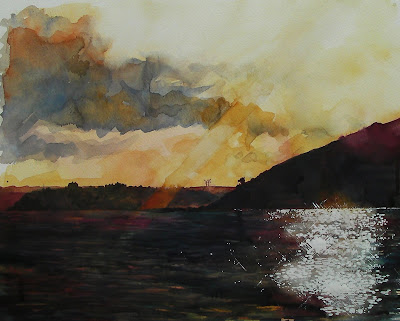
Lots of water, lots of paint, layers running into one another, suggestions of fields and trees on the coastline.


Last Light, Pendennis Point. Watercolour 50cm x 40cm or 20 inches x 16 inches
The setting sun colours the sky, leaving the sea to turn a silky indigo.


Bands of light stretch across the bay as another day is put to bed.

This, for me, is possibly the very best way to spend a Saturday night!

Friday 26 June 2009

Looking at pattern in the landscape or seascape


Patterns in the sand. Mawgan Porth, Cornwall. Photo: Vivien Blackburn

I really enjoyed the slide shows of Gesa's beachcombing and thought I'd show something similar ... but a little different :>)


I'm often attracted by strong pattern elements in the landscape (seascape) - the pattern of shining wet pools or ripples, the bands of colour, or textures and shapes of rocks. Here are a few from my files across the years. They were taken in Cornwall (Mawgan Porth, Cape Cornwall and Sennen Cove), Devon (Hele Bay and Lynmouth) and North Norfolk (Hunstanton, Holkham and Wells next the Sea).

The pictures of the sand, sculpted by the sea are near the low water mark at Mawgan Porth in Cornwall. The wild seas sculpt deep pools out of the sand and as the water evaporates it leaves miniature steps down the sides, where the water has washed against successive mini 'cliffs' in the breeze. The beach shelves fairly steeply so the tide doesn't go out too far. The pools themselves make a pattern across the beach at the seaward end. They can be over 2 feet deep and walking to the surf is a zigzag path around them.

In Norfolk in contrast, the beach shelves very gently and the tide can go out for a mile or two, moving in or out rapidly over the flat beach. Pools of water are much shallower here,and the water nowhere near as clear, as it contains silt from the rivers and drainage dykes that join the sea from the farm land around the Wash (a large bay).


You may well enjoy the work of Tony Howell who takes fantastic photos of Cornwall, I really like his close ups of rocks.

Wednesday 24 June 2009

Beach patterns

... and while I'm hunting for individual treasures I stumble across these... patterns: all over the beach, shoreline and in shallow waters. The marks nature makes... lines left by waves, by sand worms, snails, and other assorted life that crosses the water line.

So many possibilities. Or will I just stand and watch a little longer.

Monday 22 June 2009

Beachcombing

... with the nose firmly down and the eyes peeled to the ground, I need to remind myself to look up to the sea, the horizon or the gannets diving for some fish in the distance.

I'm torn between the sweeping seascapes - to sketch up to the horizon; and what is right in front of my nose. Well - far too often the horizon line still wins in this little contest. But look at some of my newest finds, to clutter yet more shelves and to help me imagine a faint scent of wind, salt and sun from yet another - far too rare - day out at the seashore, beachcombing.


Saturday 20 June 2009

Acrylic sketches

Savage Cove
6 x 8 acrylic

I've taken some acrylics on a field trip to the ocean for a couple of plein air sessions. Its a challenge working with acrylics outdoors, at least for me. They dry so quickly, but on the other hand, if I sit them on a wetted paper towel and keep rewetting it, that keeps the palette from drying, but it still leaves me with little time to manipulate the paint on the canvas. I end up with lots of thin layers or else big gobs of paint that give me a little more wiggle room.

I wanted to try acrylics in plein air so that I could more accurately capture light and colour instead of having to refer to photos which never seem to capture quite the same colours. I wanted to try acrylics so the painting would dry and not smear all over before I got it home and its easy to wash up on the spot, not leaving the steering wheel of the car paint stained as it seems to do when I use oils plein air.

Waves, Pouch Cove
5 x 7 acrylic sketch

It has benefits, but is also frustrating too. I may in the end get some acrylic extender to prolong the time I can manipulate it, if I continue with acrylic sketches. I like being able to get that instant feel of colour and light, but hate fighting with paints.

I know there are other , more convenient mediums such as pen and ink, or coloured pencil or even pastel that I can use to do some plein air sketches, but I like the almost instant feel of acrylics or oils. The one up from a photograph perhaps.

I`ll continue to experiment with acrylics for sketching outdoors and see if those little pieces will translate into larger pieces back in the studio. I wonder how many sketches actually turn into larger pieces for artists?

Wednesday 17 June 2009

Expressionism versus impressionism

I'm always fascinated by these two terms and the use of it and it seems I always get it wrong even though I can give their definitions.

I have done a few paintings on which many people give many different opinions and the scale weighs in equally at expressionism andt impressionism. I think there is a grey area today, boundaries overlap with marriages between all the different styles of painting. Is it a good thing or a bad thing, or nothing at all? Does it perhaps make it bad art? Or doesn't bad art exist? Is all art good? Is good painting all about a solid knowledge of technique, or can a strong ambiance and emotion save a poorly executed painting?

...la Loire scintillante...
oil on canvas, 22x33cm


For quick explanation I used wikipedia to define:

Expressionism "...It sought to express the meaning of "being alive"[2] and emotional experience rather than physical reality.[2][3] It is the tendency of an artist to distort reality for an emotional effect; it is a subjective art form.......generally the term refers to art that expresses intense emotion. It is arguable that all artists are expressive but there is a long line of art production in which heavy emphasis is placed on communication through emotion...."

Impressionism "....Characteristics of Impressionist paintings include visible brush strokes, open composition, emphasis on light in its changing qualities (often accentuating the effects of the passage of time), ordinary subject matter, the inclusion of movement as a crucial element of human perception and experience, and unusual visual angles...... Painting realistic scenes of modern life, they emphasized vivid overall effects rather than details. They used short, "broken" brush strokes of pure and unmixed colour, not smoothly blended, as was customary, in order to achieve the effect of intense colour vibration...."

Looking on different art sites, there are categories of styles: expressionism, abstract, impressionis,, contemporary, modern.... does it give more worth to a painting if it can clearly be classified as Impressionism, or Modern contemporary, or Classical... I have also been asked before..: what style of painting do you do?" to which I start blabbering, because I have no clue. I sometimes paint something SO distorted that it can be nothing else BUT maybe surrealism and other times I'm thinking Impressionism when in fact it is plain and simple realism. It sounds confusing just writing it all down here, reading it must be even worse and as all artists will know, doing it, is the challenge.

Not that it bothers me in any way not to have a particular style. I don't search for a certain style. I dont think anyone can, really. You are what you are. And your art reflects who you are. but I certainly feel flattered when a style is recognized in my work!
I recently saw paintings from someone who attended a Charles Reid workshop and his paintings speak of CR influence. This artist's paintings project his effort and hard work at trying to incorporate this free style of CR. I somewhat feel uncomfortable looking at this work. It makes me feel fatigued, as if he had worked very hard at getting this effortless look. I feel as if there is a wordless desire behind his work, asking for the real him to be released and I wish this artist would give in to that desire. I would love to see the work of the real him.

Any opinions?

Tuesday 16 June 2009

Vivien says I must use more watercolour!

I posted this watercolour with coloured pencil scribble on my sketchbook blog yesterday. It's so unusual that I use watercolour that it generated It's a watercolour......... as a title for the blog post!

Willow Pond 14th June 2009 5.00pm
watercolour and coloured pencil in Conté à Paris sketchbook
copyright Katherine Tyrrell

Vivien tells me that using CP on top of watercolour is an ace wau to sketch and that I should do more of it....and I agree. I do very much like the feel of CP on top of watercolour and the way that you can use it to obliterate mistakes with where the brush went!

However I'm going to have to find the right paper for working watercolour with CP on top as there are very few pages left in this very old sketchbook (from Cornelissens and started in 1991 in my pre CP sketching days!)

Any suggestions as to the best paper for watercolour and coloured pencils?

This is yet another view of Willow Pond in the Ecology Park Pond series.

Saturday 13 June 2009

Digital imagery - using the computer to think around ideas for painting

Dawn at Sennen. Digital image, Vivien Blackburn

Sometimes I like to use the computer to work out ideas for further paintings using the sketches and paintings I've done plein air.

These are 3 I've done that may well find themselves developing into oil paintings.

The top one is a combination of the pearly dawn sketches and the wild seas - which were in a totally different light but the movement of the waves was beautiful, as were the dawn colours. Result = wild dawn :>) - I can definitely see this one being developed in paint.


Rainy Day at Sennen Cove, digital image. Vivien Blackburn

This one would lend itself to being developed as a a watercolour and coloured pencil piece don't you think?

Stormy Day, digital Image, Vivien Blackburn

With its muddy colours this one has more of an east coast feel - again it could be interesting in oils.

What do you think?

Do you use the computer this way?

Thursday 11 June 2009

Floating Studio, Be It Ever So Humble


With a title like this, perhaps you were expecting this or maybe something like this

But, be ever so humble, there's no place like our own canoe. I usually bring some art supplies along on our trips. Sometimes it's my tiny box of watercolors and Niji brushes. Sometimes it's only a pencil and paper. I'm lucky that the captain of our little boat supports the occasional mutiny of the first mate! But to be fair, we really need an anchor so someone does not have to keep us pointing away from danger.

Recently, I learned how to use the tiny film function on my camera and here is a tiny snippet of a canoe trip.


You can see another snippet of video from the same triphere

Wednesday 10 June 2009

Niagara Falls Suite


Niagara Falls Suite # 2
22" x 30"
Ink, acrylic and watercolor on paper


Niagara Falls Suite # 3
22" x 30"
Ink, acrylic and watercolor on paper


Niagara Falls Suite # 1
22" x 30"
Ink, acrylic and watercolor on paper


Niagara Falls #4
22" x 30"
Ink, acrylic and watercolor on paper

I could have spend hours at Niagara Falls however, our visit was sandwiched in between two 18 hour car rides with Derek's commencement ceremony being the real filling. Although there was a bit of grumbling from the family about adding more driving hours on to the trip, when we all got there, we all felt overwhelmed by the grandeur, power and visual impact of the falls. As you can hear from the short video, it's also very loud.


The Canadian Side


View Larger Map

I madly scribbled in my sketchbook as we strolled along both the American and Canadian side. We'd been warned about the honky tonk atmosphere on both sides of the falls, but we tried to close our eyes going through these areas. The American side has a nice park that goes along the edges of both Horseshoe Falls and the American Falls. But the Canadians have, hands down, the most beautiful, if soggy view. You can see from the video above that the lens was getting a dusting of droplets during the filming.


I have about 12 sketches for a series of paintings, I was so profoundly moved. The scale, volume of water just sucked me in, so to speak. These large drawings feel more like sketches to me. The drawing at the top could only end up on a full sheet of watercolor. Anything smaller and I would loose the feel of the place. What I feel working this big is a huge amount of freedom and I find by working on 3 at once, I'm less likely to tighten up by being afraid of messing up.

I'm working toward applying the paint with reckless abandon...working to express the headlong rush of the water over the falls. However, it is possible that I'm going over the edge in a barrel: blind and out of control creatively. Also, the white on white does not read very well on screen.

If you'd like to see more still photos, you can see them here.


Here is anothervideo from the American side if you'd like to take a look and also, my initial sketchbook drawings are here.

You can find a brief history of the falls and other interesting facts (like what happens to the falls in the dead of winter here.

Ronell was kind enough to send methis link for a group of plein air artist's working at the falls.

Tuesday 9 June 2009

In The Frame

Framed! I collected these two from the framers yesterday and thought I would show you the results. I LOVE them. They are "floated" on a white board with white wooden frame. This is how all of mine look in the gallery and I think it works very well with the light down here and also with the nautical, watery themes that I paint.
I am always surprised at how much a frame makes a picture and think that it is as important a decision as every other decision that one makes when creating a piece of art work


The question is, what criteria do you use when deciding on a frame? It is almost like choosing new glasses or a haircut!
Personally I like to try to reflect some of the aspects of the painting... I paint very figuratively with quite a lot of crisp detail (well that's how it seems to me) but I do like to let the brush strokes and the way the paint is applied do some of the talking. Therefore I wouldn't choose a hard precise metal frame, I might go for something softer, more tactile, like wood.
But I use crisp colours and enjoy the effects of light so something that will enhance that and show that element off...so choose white wood.
I was messing around here and trying to see if my theory worked so I have digitally put this one into an antique style ornate frame.
To my mind the fiddly nature and the colour take quite a lot away from the painting. See how the mud and water has faded into a bit of a non-discript background.
In the final "digital frame test" the colour and detailing on the wood and the fact that there is no breathing space around the picture have given it a cramped and cluttered feeling. While as it could be seen as a cramped and cluttered painting it needs the bright clarity of the Cornish light in which it was painted.
These, of course, are only my opinions.


If you have a painting and want to try what different frames will look like why not do some digital jiggery pokery like these. Or try uploading your image to something like Pictureframe, where you can see how it will look with endless different frames. There are lots of good online framing sites where you can do this before you order your frame.

Monday 8 June 2009

June 8th is World Oceans Day

Today is the inaugural World Oceans Day - with the theme “Our oceans, our responsibility”.

It's also the day that a new film asks us to imagine a world without fish.

Oceans cover 70% of the world and are vital to
  • the regulation of the global climate
  • the balance of the ecosystem
  • the sustenance of people 's livelihoods around the world.
Greek Fishing Boats
(Pastel 19.5 x 25.5")

copyright Katherine Tyrrell

An increasing number of countries have been celebrating World Oceans Day and our connection to the sea on June 8th since a UN Conference in Rio de Janeiro in 1992.

Last year, the UN General Assembly finally confirmed that, as from 2009, 8 June would be designated by the United Nations as “World Oceans Day”.
The oceans are essential to food security and the health and survival of all life, power our climate and are a critical part of the biosphere. The official designation of World Oceans Day is an opportunity to raise global awareness of the current challenges faced by the international community in connection with the oceans.......The theme of World Oceans Day, “Our oceans, our responsibility”, emphasizes our individual and collective duty to protect the marine environment and carefully manage its resources. Safe, healthy and productive seas and oceans are integral to human well-being, economic security and sustainable development.
Secretary General, UN
Damage to the oceans
Eating fish is good for us, but catching it in the way we do devastates the sea. Nearly nine tenths of European stocks are overfished, and around a third are beyond safe biological limits: that is, the adult population is too depleted to provide replacement stock. Almost all cod caught in the North Sea have not had a chance to breed.
The Guardian - World oceans day: all the fish in the sea
Here are some of the human activities and other changes which we need to be concerned about:
  • Overexploitation - through illegal, unreported, unregulated fishing and other destructive fishing practices - is severely damaging important fisheries and vulnerable marine ecosystems, such as corals.
  • Fisheries are also being damaged by invasive alien species and marine pollution, especially from land-based sources.
  • Climate change has produced an increase in sea temperatures, sea-levels are rising and there has been a rise in ocean acidification - all pose a further threat to marine life, coastal and island communities and national economies.
  • Criminal activities threaten lives and the peace and security of the oceans. Piracy and armed robbery against ships threaten the lives of seafarers and the safety of international shipping, which transports 90 per cent of the world’s goods.
  • Lives are also threatened through the smuggling of illegal drugs and the trafficking of people by sea and across oceans
Raising awareness

The Ocean Project has been one of the organisations which has been promoting the notion of World Ocean Day and for the last six years it has been helping aquariums, zoos, museums, conservation organizations and agencies, universities, schools, and businesses to celebrate World Ocean Day.

It's got a very well developed website which is well worth exploring. Here are some of the aspects which are worth taking a look at:
You can also read more about it The Guardian's Editorial today World oceans day: all the fish in the sea

I learned about World Oceans Day through Stephen's Fry's 'tweet' about the film The End of the Line which asks us to imagine a world without fish

Do you eat fish and like fish? I do and that's why I've told you about World Oceans Day. If you're concerned too why not tell somebody about what's happening today?

Sunday 7 June 2009

Water corners

We came back from Coin Perdu this week where, besides working on the house, I did some plein air painting as well I loved every minute!
Vivien has a great detailed lay-out of a well equipped outing. See What to take when sketching plein air.
As well as Katherine's 10 tips for working plein air on Making a mark.

What I'd like to mention and demonstrate, is how much mood influences me, and I suppose all other artists, when I'm outdoors, painting.

...le ruisseau monte...

With the above painting, everything was wrong.
I stepped in a hole when walking down to the river, fell and all my equipment scattered over the place.
I chose midday on a hot day to walk down, thinking I would be in the shade by the river, but I didn't take into acount the long walk down, the heat and sweating which attracted a neat horsefly to sting me, causing an enormous red lump and non stop itchhing and burning.!
At the site I saw the previous day, which then looked perfect, I walked up and down in search for that same perfection. But of course, I was in another day.
During the course of the process, my palette slipped from my hand, falling face down on the ground and it took me a while to get rid of the dirt in the paint. By then, I was way past frustration. But I'm not one giving up easily. That would make me a quitter. I don't mind losing in life, but I hate quitting. So I was determined to finish this painting, which I did.

By the time I walked back to the house(even with Hartman helping me), I was just this side of a corpse. My feet were lead. My ankle hurt from the fall. My head pounded. I was irritated. The sting was burning and aching. Mighty hungry and dead tired. I went to bed and slept. In the middle of the day.
Post mortam came after a shower and good coffee in the welcome coolness from the late afternoon.

*I realized how much mood influences any kind of art making, but especially outdoor painting, where you have a limited time to start and finish a piece. It is a now or never situation. Circumstances will be different tomorrow.
*You don't have the luxury to put away the brush and come back to it later.
*The changing light doesn't leave you any options either.
*And knowing you've gone through all this effort to walk down here(it is hard work to do plein air painting!) adds to the adrenaline of getting the job done.
*I also realized that a scene that looks wonderful today, won't necesary look the same tomorrow.
*It isn't always the most breathtaking scene that ensures a breathtaking painting...on the contrary.

My mood improved and all was well.

...la frontiére...

...detail...


...le forêt...


...detail...

...frâicheur...


...detail...

Saturday 6 June 2009

The 'aha' moment

Cliff edge, Pouch Cove
8 x 8 oils

You know how you struggle to do something for ages then suddenly the light goes on in your head and it becomes clear as to what you were doing wrong? This is the painting that did that for me.

I have been re-learning oils for probably the last six months. My strokes have been timid and I have been stingy with paint. This painting, of a cliff edge in Pouch Cove was started purely as a relaxation piece and a study in rocks, but seemed to flow. The water, the colours, the thickness of paint seemed to come together and point me in the right direction.

Maybe it was the fact that I didn't have a goal with this piece or a deadline that relaxed me enough toe xperiment and be bolder. I know I will never change my style, which does tend to be more subdued rather than bold, but I like to think that I can enhance it and push it to become more refined and natural.

Now can I do it large scale? Small is safe and easy, more or less. I want to have the same impact of water and land but on a large scale. I guess there's only one way to find out, isn't there?

Monday 1 June 2009

Working Afloat


On board I have a little sketchbook. Well to tell the truth I have a lot more than that, I have a whole array of drawing and painting ephemera, ready for longer trips, overnighters and "round Lands-End", that sort of thing.
For the first few trips in the "studio boat" we have sailed out into Falmouth Bay, up the Helford River and also out to sea... for five nautical miles!!
Anyway... to start my "Cornwall from the sea" project I have been scribbling away in my little on board sketchbook. "The Captain" gets a bit annoyed when I am too busy to ready about or sling the anchor in or all of the other nautical things that need to be reefed or hoisted or hauled but I make valiant efforts to ignore him and get some drawing done.


I can tell you it is a difficult job, the boat heaves and pitches, the scenery is all so beautiful that I want to draw EVERYTHING!
So I scribble away with a lovely pencil that is water soluble and smudges and washes blue with the water brush/pen.


I take photos too but most of all I try to get into my head how the land meets the sea. The lush wooded sides of the river, the little nibbled beaches and tall granite cliffs over which tumbles the land. Then it is home to the studio on dry land where I attempt to convert all of that into a finished piece. It is boiling hot here, cloudless blue skies, the dry land studio is hot too and I think that might be influencing the pictures... lots of blue skies and deep, cool, green sea. I am going back out on the boat, going to strip off and dive in!

Anyway here is one finished painting. I am putting them onto "paintmap" too so that you can see exactly where in the sea I was bobbing.
OK, off for that swim...