Friday 31 December 2010

Watery Norway scenes

Surfacing here on the very last day of the year to wish all Watermarkers and our readers a very Happy 2011! I have had fewer watery pieces to show this year, but here are some from my recent mid-December trip to Norway. They will already be familiar to most of you, I think.
I am purposely not overplanning my art life for 2011, but one thing I know---water will figure in it, somehow, somewhere, and I will be here sharing it! I am so grateful to be a continuing part of this talented group.

Norway: sketches from moving boat

Norway: sketches from moving boat

Norway: sketches from moving boat

Norway: sketches from moving boat

Norway: sketches from moving boat

Norway: ever northward

Sunday 26 December 2010

Saving the boat


I created this watercolour over a period of time.  It was one that I sketched out on a half sheet (15" x 22" ) of 200lb paper a few months ago, then abandoned it for awhile.  I haven't slept well for a few nights so was up very early (4am!) and decided to play around with it again.  Kind of kill or cure.

I added layers of wash to the water and detail to the little dory to bring it to a more finished level.  There are flaws in it, but there are also ways around flaws if I want to preserve this piece from the bin.

1.  Composition.   The boat is dead centre of the painting.  Dead centre is called so because it makes the painting uninteresting and doesn't let the eye wander around the piece, picking up other elements.

2.  The horizon line.   I painted this on a fairly flat surface without standing back as much as I should to see my progress.  As a result, the horizon line is tilted upwards on the right.

So how to correct this?  Instead of scrubbing back and risking making it worse, simple crops can help save this piece.

The first option is to eliminate the horizon altogether, concentrating on the dory and the water.  This isolates the boat and doesn't give any options to the viewer but to look at it, but still has the challenge of a central focal point.


The second option is to crop from the side as well as the horizon.  This knocks the focal point (the dory) off centre and allows the viewer to examine the changes in values in the water, sending the eye around the painting and back to the dory again.


The crop can be from either side depending on how much space there is.  In this option, cropping the left doesn't allow a lot of space to the right and brings the dory into the foreground more, reducing the overall size of the piece.

Which would you choose?

Tuesday 7 December 2010

Water studies


While I have several projects on the go at once, there are several water-related ones that keep jumping into my head and insisting that I make some inroads on them.

Reflections on water is the predominant image that calls me and I've done a couple of studies in preparation of larger pieces.  I'm a firm believer in doing studies that let me work out most of my mistakes before I translate them onto a large canvas.


The first is a simple water pattern in late evening on a local pond.  Its not complete in terms of light but enough information is there to make it recognizable for what it is.  This is done on in oils on a 6 x 12 gallery canvas that I reclaimed from another start that didn't go as planned.


The second piece is strong reflections on the surface of slowly moving water. The distorted shapes create an abstract pattern and lots of negative shapes to work from.  Its a bit of a puzzle to paint but a little concentration helps as well as the small size of just 6 x 6 in acrylics.  I wanted to ensure that I would like to do this before I went larger with this one.   I drew this up on a 20 x 20 canvas and will work on it as and when I can.

Tuesday 23 November 2010

forthcoming exhibition in market harborough


I've been painting madly to produce some small works for an upcoming exhibition with a small group of friends.

We meet up once a month to discuss art, crit work in progress, go to shows, put on exhibitions several times a year and generally talk about anything art related - and lots more besides :>).


These are some images that are going to be printed as cards - it means people have something affordable if they can't buy a painting.


They are all computer manipulated so aren't reproductions of work but are based on work I've done and exist only in this form. More here.


I'm also responsible for the publicity, posters and fliers - if you can make it do come and see us.

< Click the poster for further details if you are in the area


And keep your fingers crossed for us on the first weekend of December :>)

Saturday 13 November 2010

Schönbrunn Park - after Klimt

Schönbrunn Park (after Klimt)
Caran d'ache Neocolour in Derwent Black Book
copyright Katherine Tyrrell
I'm studying Klimt landscapes at the moment - and also testing new art materials, specifically the new Black Book by Derwent.  This is the result.

It's an "after Klimt" drawing of Schönbrunn Park - specifically of the tall trees and one of the pools and the reflections.  He likes trees a lot but also seems to rather like water in his paintings.

I'm trying to get my head round both how he composes his images and the marks that he makes.  I think this one is rather better at the former and not too good at the latter!  I was missing some mid green colours which are needed to make this a more effective colour match.

The necolour crayons certainly work very well with the Black Book and I think they might become the preferred media for this sketchbook of smooth black paper.  Now to see if they sink in (the perennial problem with black paper) or remain on the surface!  What I have discovered is that there's absolutely no point in wetting them on this paper as they go to nothing.

Note:   This is a link to the Schönbrunn Palace in Vienna, Austria - which is a UNESCO World Cultural Heritage Site and a tour through the park

Friday 29 October 2010

Mission Trails, California

detail from larger work

Katherine and I are taking part in an exhibtion in California in November with friends - details later.

At the end of this post is a slide show of the work I've done - there are 5 paintings, with close up details following.

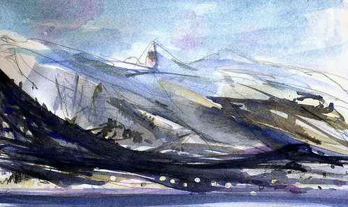
The work is based around Mission Trails Park in California. I needed to work around how I was going to tackle painting an area that is so different from the usual land and seascapes I paint here, in a very different climate. Needless to say it ended up involving water :>) Unusually for me, I was working on painting a place I don't know personally - a friend had provided photos and I used Google streetview, which was really useful for getting a feel for the area and did lots of research. Still, it was difficult. I usually work plein air and learn the feeling of a place as I sketch.

I started with the coloured pencil drawing of a still pool, reflecting the trees behind, the dry landscape very different from England - but the rocks and trees and reflections all interested me. I was trying to get to grips with the landscape there, the aridity, the rockiness, the mood.

As I thought about it, I realised that I wanted to abstract the images a little, play with texture, time, and shape and colour, experiment and include collage. All the works except for that first one are mixed media, using whatever was going to make the kind of mark I wanted. The joy of collage is the ability to move elements around to work out the composition before finally sticking down.

This is the final version that the above detail is taken from


It went through several incarnations on its way and further work with scissors as it became rather overcrowded and needed room to breathe :>) I would have liked to have given it even more room but had to work to a specific size - 11x14 inches so that it would fit the frames at its destination.

Each tree is a separate piece of paper, with watercolour, monoprinting and drawing to create the bark. The background is also collaged and then painted and drawn into.

Each was pure experiment with only a loose idea of the final result, responding to the marks, moving the trees and background pieces around until I felt they could be fixed.

There is watercolour in there, coloured pencils, ink, acrylic, gouache, biro (ballpen) and charcoal pencil - maybe other things that I've now forgotten!

The dark background helped with the fragmentation of the image, the changes in time/viewpoint and linked to the black of the charcoal and biro. It isn't of a specific place but plays with a mix of elements from many sources and imagination.

The colours play with warm and cool neutrals against the blue of the sky and reflections - the touches of warm apricot tones glowing against the blue (I hope!).

The 'some, a little and a lot' guideline applies - with most of the painting in neutrals, the blue and purple becomes more important.


If I'd had Sarah's instructions on varnishing watercolours in time I would have tried it out on this one - I think it would work best without glass.

you can see earlier versions here

Towards Dusk

This one again plays with the idea of time and fragmenting the image. Daylight moves into dusk.

What do you think?


Sometimes you have to look long and draw fast!

Volissos Fishing Boat (Pastel 19.5" x 25.5")
I don't know if you've ever had a go at drawing boats but their 'architecture' and the way perspective works is a bit different to buildings!

I was reminded of this while accompanying Sarah Wimperis and her husband around the Royal Society of Marine Artists exhibition (see my REVIEW: Royal Society of Marine Artists - 65th Annual Exhibition 2010)

Listening to "Big Dave" tell me about which boats had NOT been drawn or painted by people who understood boats convinced me that we shouldn't try to "hack it" when drawing boats.  Just like wildlife or flowers we should always take some time out to work out how they are put together and what makes them work.

It seemed to me that careful observation is probably the key.

I was then reminded of an experience I had in Chios, a Greek island in the northern Aegean Sea, back in 1995.  I was staying in Volissos and we were drawing fishing boats down in Limnos harbour.  Or rather I was trying to draw fishing boats.  I was having one of those experiences where you gradually begin to understand this is a LOT more difficult than it looks and that I had attempted a subject I didn't understand - and I was making a complete pig's ear out of it.

Before lunch I decided I needed to do something to make sure that it hadn't been a completely wasted morning - and to see whether I'd learned anything. 

I took a complete sheet of what was known in those days as Rembrandt Pastel Card and drew just one boat "up close and personal" in pastels. 

The trick was I didn't think too much about what I was looking at but rather tried to observe closely and use what I'd learned in terms of the big shapes and proportions and basic structure of a boat.  I got it very nearly right (it bulges a wee bit too much on the right hand side!) and I think drawing on a big sheet also helped.

The drawing at the top was actually completed in 20 minutes - at the end of which I seemed to have produced a boat which was not immediately about to fall over and sink! :)  Honour was redeemed.  It would appear that the whole morning had not been a lost cause and that maybe I had learned something.

Monday 11 October 2010

Varnishing Watercolours

 I have done it!  Varnished watercolours, there if a full explanation of the whole process over on my blog The Red Shoes for anyone who wants to give it a go.

But I have to dash now, got to make supper!

Wednesday 22 September 2010

September On The River

September on the Helford  River in Cornwall.  It is so much quieter, many of the holiday craft have gone home, there is a thoughtful quality to the air.  It is peaceful and perfect for a few small plein air watercolours.
These are tiny, the biggest being about 21 cm long, that is just a tadge over 8 inches and all about 8 cm high (3.5 inches).
Also shown here is the scrappy little sketch, done in Biro, which I used to "warm up".
I am planning to varnish the paintings, it is a new process which involves a UV isolation coat then picture varnish.  This gets rid of the need for glass in the framing which, in my opinion has three main advantages: 
Glass makes horrible reflections which I think detract from the painting. 
They are easier to post or transport and therefor sell. 
I can experiment with framing and adding things, these for example will be framed together with tiny found objects that I collected at the time.
I shall make a separate post about that. So be excited, be very excited... I am.
Now, I am off to catch a tiny ferry across this very river to walk the cliff, do some more painting and talk to a little gallery there... its a very tough life!

Tuesday 14 September 2010

work in progress, Vivien

Above and below: details from an experimental collage/mixed media development from tree sketches. Vivien


I'm experimenting with collage and mixed media to develop the recent images of trees (and of course water!)

The trees are done separately and stuck down with spray glue so that they don't become wet or stained with adhesive. I've played with marks - running paint wet-in-wet, splattering, drawing into wet paint with the wooden end of the brush, adding the occasonal bit of coloured pencil or watercolour pencil and keeping everything loose and abstracted.

There is a 'frame' around the central section, made up from trees at each side and tops of trees at the top - at the bottom the rocks create weight to balance these. The 'frame' is a deliberately disjointed, with elements that cross into it but a clear break elsewhere. (see link to whole image and further close ups below)

The pool with its reflections is worked loosely on yet another piece of paper that is collaged in.

Most of it is done in watercolour with different papers - white, cream and pale browns worked over in the various media. There is also coloured pencil, ink and a small touch of buff titanium acrylic in the final touches here and there.

(That's a colour I find really useful, particularly for doing the edges of canvasses - no mixing to match the colour for second coats)


Feedback/crit/comments very welcome :>)

Monday 13 September 2010

Bluegill II


I'm still plodding away with my gyotaku project and have all kinds of fish from the weird to the wonderful.  These little bluegills are found all over North America and I love the shape and size - pan size and very good eating I'm told.

I did a study of them to work out colours and composition.  The paper was pretty absorbent - Okawara - so I thought I'd take it to the next level and really add a shot of colour. I flooded the surface with a highly pigmented wash of watercolour in various colours that complement the natural colours of these fish.  Its as if they're swimming in a dream world now and I rather like the outcome.  The print below is the original study print with a small amount of colour added.

The paper was still damp when I took this image so it will be slightly more subdued when dry.


Experimentation is what this project is all about after all and testing the abilities of Japanese papers. I'm quite amazed at their strength when wet.  The papers have a perceived fragility when you pick them up as they're so lightweight and flexible, and, like most papers, are fragile when wet.  However, I can put a lot of water and manipulate paint on them very well without the paper or the print breaking down.

Japanese papers vary so much in type and price.  They're not cheap papers which is why I often work out pieces as studies first on newsprint or cheap mulberry paper before I pull out something more expensive.  I would recommend people try some Japanese paper if they can access it.  Its a unique experience and has so many possibilities.   My source for good quality paper is The Japanese Paper Place in Toronto.

And now for a quick smile from one of the more different fish that I am printing.  This is a smile from an ocean pout.  I was given this fish and didn't realize it had quite the set of teeth til I started prepping it for printing.  The fish is about 16 inches long and rather like a cross between a sculpin and an eel with a big bony head.  I'm rapidly getting over my fear of strange and weird fish that, in the past, would have had me in the horrors.

Saturday 4 September 2010

Rennies Mill River


I'm still working on my little series of hidden rivers, albeit slowly and sporadically.  I have a number of rivers or perhaps better called streams and they mostly haven't got a lot of 'oomph' to them, acting more like cuts through the land than fast moving water.

I had created a rough pastel on Rennies Mill River which crosses the city and through the Waterford Valley, heading to the sea. My viewpoint here is flanked by a ball field on one side and a supermarket car park on the other.  It leads under the road and empties into Quidi Vidi Lake which is a popular spot for joggers and ducks.


When I look up this river, it transports me to another place entirely. I decided to see how the same view would translate into oil paints.  The painting at the beginning of the post is a 5 x 7 piece, started last night and completed today.

I still have quite a number of rivers to document and between fish and printing, it could take some time.  However, it will be a good project to keep me going during the winter.

Wednesday 25 August 2010

Another Tack... Ready About!

As some of you may, or may not, know my "day job" is the most enjoyable one of being an illustrator.  I have done this for about 15 years now.  Before that the "day job" was a muralist until I muraled my way out of Cornwall, as my five kids were quite small I decided that something more home based was a good plan, found myself an agent and started illustrating.  Very soon it became necessary for my partner in crime to become the "house husband" as the illustration work grew.  I learned how to work with a graphics tablet using a great programme called Corel Painter.  So the illustration became created on a computer. 
I still painted when I could but not nearly enough.  Flash forward a few years and the youngest child flew the nest so I started really painting, quite fast and obsessively.  It was a distraction from that dreadful empty nest.  So then I had two sides, like a split personality, illustration and painting. 
Now for the exciting bit... Just recently, through a chance meeting over one of my paintings I have had the chance to do some illustration work that is much more like painting.  It might well develop into quite a big thing.  I have always earned my living, somehow, using my skills as an artist and I must say that there is, for me, a great pleasure in selling work!  I think in my head it allows me to work, it is such a nice way to live you see that I think I must feel guilty!!  Anyway as a result of going slightly off piste with both the illustration and the painting I seem to have found yet another personality that wants to get out.  I am planning a trip around all the little ports of Cornwall to make plen air paintings in a most illustrative style, so watch this space for paintings that are beside the sea, but not what I usually do.  I expect they will be a bit like the one below but with harbours and cottages like the ones above.  I will keep you posted as to how it all progresses.

Monday 23 August 2010

Ferryland


I have a continuing interest in islands and while I don't often manage to explore them, there are enough within reasonable travel distance that I can view them when I want.

I was in Ferryland last week and wandering around the Colony of Avalon, an archaeological site there.  The colony was founded by George Calvert, later Lord Baltimore, in 1621. Most people have no idea that permanent European settlement in North America dates so far back, and that Newfoundland played such an important role. The Ferryland settlement was "forgotten", and its remains lay undisturbed for centuries.

Map of Ferryland, 1693.
From D.W. Prowse, A History of Newfoundland from the English, Colonial, and Foreign Records, 2nd edition (London: Eyre and Spottiswoode, 1896) 111. Caption beneath image reads, "Ferryland, showing Baltimore's House. From Fitzburgh's map, 1693." Image modified by Duleepa Wijayawardhana, 1999. 
 
I stopped to look at the islands just offshore. I don't know if these islands have names or not.  Nothing seems to be listed for them that I can find.  This map from 1693 of 'Ferreyland' indicates some of the smaller islands just offshore.


However, the weather was grey and warm and the sea and sky looked similar in value. The Atlantic ocean was so calm, such a rarity!  The islands are not large enough to sustain human or animal life aside from a few sea birds perhaps.  Some are no more than rocks above the sea line, others had a lovely green/yellow coloration from the vegetation on them.

I took some photos as rain was imminent and painted a view of the islands in oils on a 6 x 12" gallery canvas.  I quite liked these islands and hope to paint and draw more of them, hopefully on a better day weatherwise.

Monday 16 August 2010

Winter pool

Winter Pools, detail, Vivien Blackburn

This is a small mixed media piece, 10 x 8 inches of a winter pool on a still blue skied day. Above and below are close ups.

It was done on Somerset paper, in a mix of watercolour, coloured pencil, gouache and ink. I like the variety of marks possible with mixed media - the transparencey and looseness of watercolour, the splattering with it; the hazing of coloured pencil over watercolour washes to create layers of colour that shine through each other, the calligraphic marks of pen - biro in this case - and the covering power of touches of gouache. The paper is quite creamy and I wanted some pure clear white in the reflection, so used the gouache to lighten it where necessary.


Back to work as I've got to produce another 4 in this series .....